Kentepunkt
Student Brief
Brief / Design a corporate identity for a new event complex that will be a cultural and business hub in Oslo, working in collaboration with architect C.F. Muller. The identity would be rolled out onto various collateral, helping to create a strong presence for the venue.
Duration / Two Days
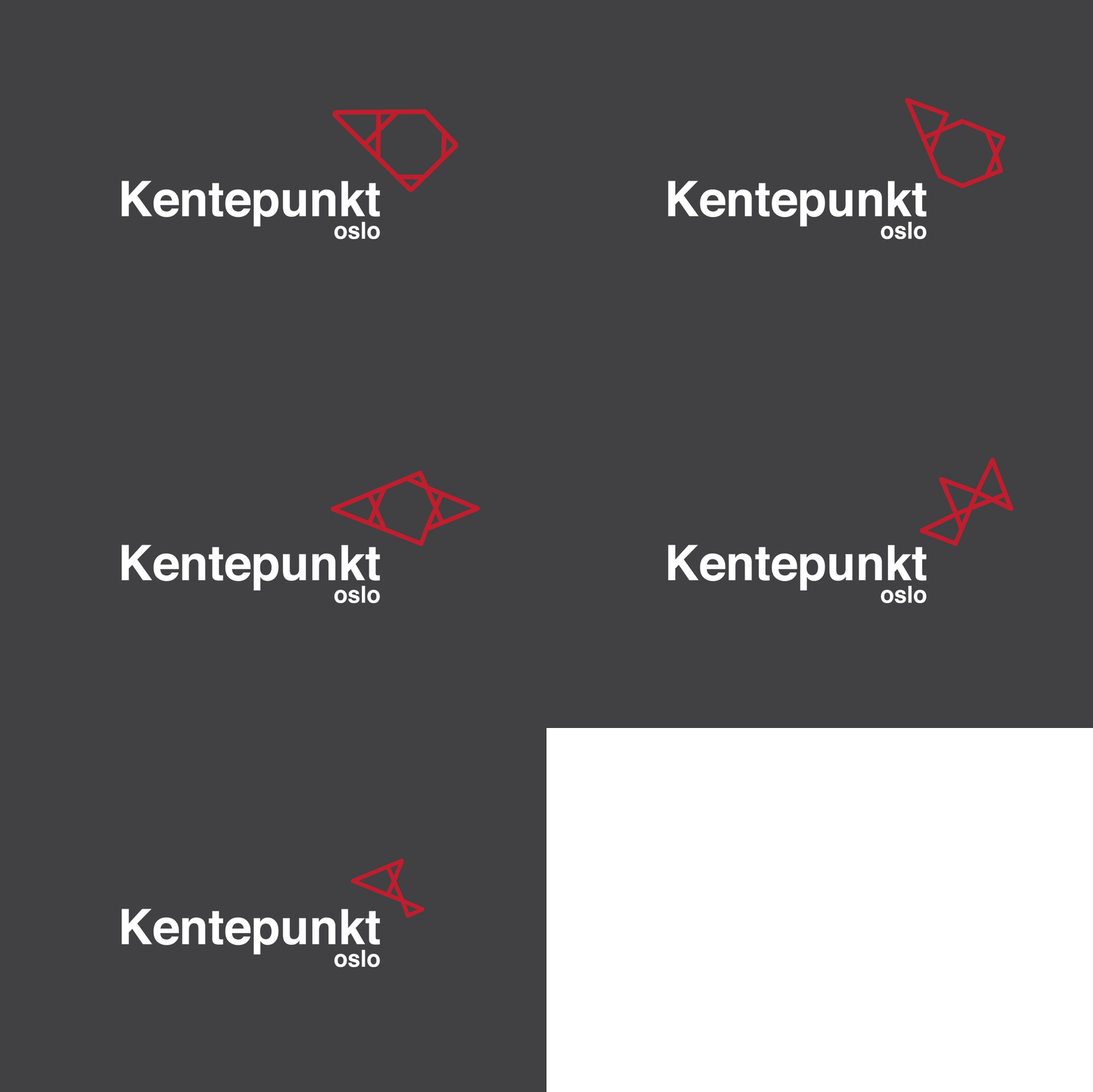
Outcome / The main logo for Kentepunkt (meaning hub in Norwegian) is based off the selbu rose, a pattern made from an 8 pointed star used in traditional Norwegian winter clothing. The icon is flexible, having the main image and then 4 others - representing the different sections in the venue.


